Visual identity, brand personality and communication.



In a dimly lit café, Linda sketched furiously on a napkin. Her marketing company, was pitching to a million-dollar tech startup in just 24 hours. The stakes? Sky-high.
The next day, armed with her napkin, Linda walked into the boardroom. She stood before a sea of skeptical faces and said, "Your product is great, but your story is invisible. Give me 5 seconds to make it unforgettable."
She flipped the napkin. Just few words: "People don’t buy products; they buy dreams."
A pause. Then applause.
In that moment, Linda’s company secured the client and a reputation for turning ideas into movements.
Segment:
Marketing
Deliverables
Research, Brand identity, Logo design
Toxic green
E1FB2B
Charcoal black
262626
Jet black
070802
Lava grey
898A8D
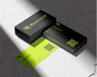
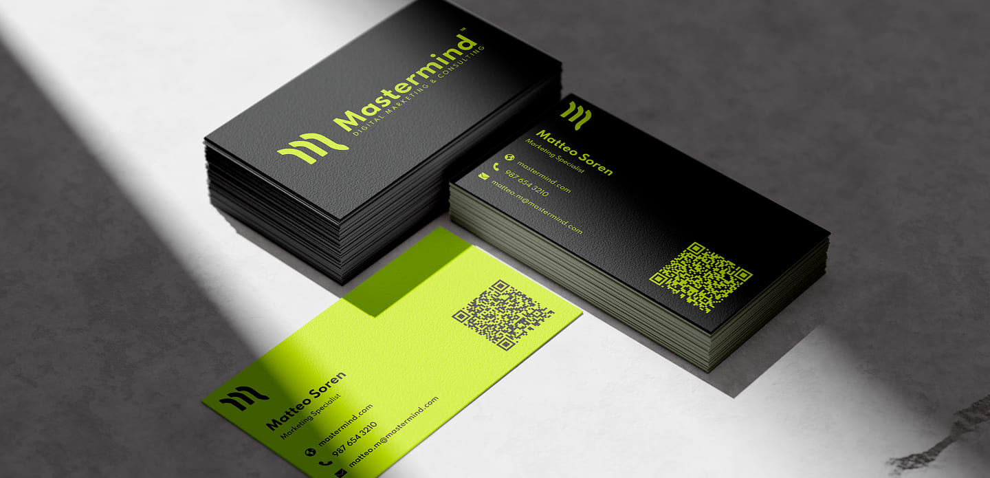
Mastermind’s mission is to empower brands to connect authentically with their audiences by crafting innovative, data-driven digital marketing strategies. We strive to turn ideas into impactful experiences that drive growth, foster loyalty, and spark meaningful conversations in an ever-evolving digital landscape.
To be the world’s leading catalyst for brand transformation, shaping a future where technology and creativity seamlessly converge to inspire trust, ignite action, and create lasting value for businesses and their communities.
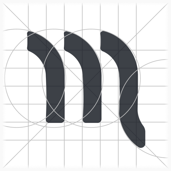
Logotype grid ensures consistency, balance, and scalability, creating a visually harmonious and professional design that looks great across all sizes and media. It provides precise alignment, adaptability for alternate versions, and enhances the perceived value of the logo by signaling attention to detail. This framework ensures the logo remains functional, versatile, and easy to reproduce across various applications.

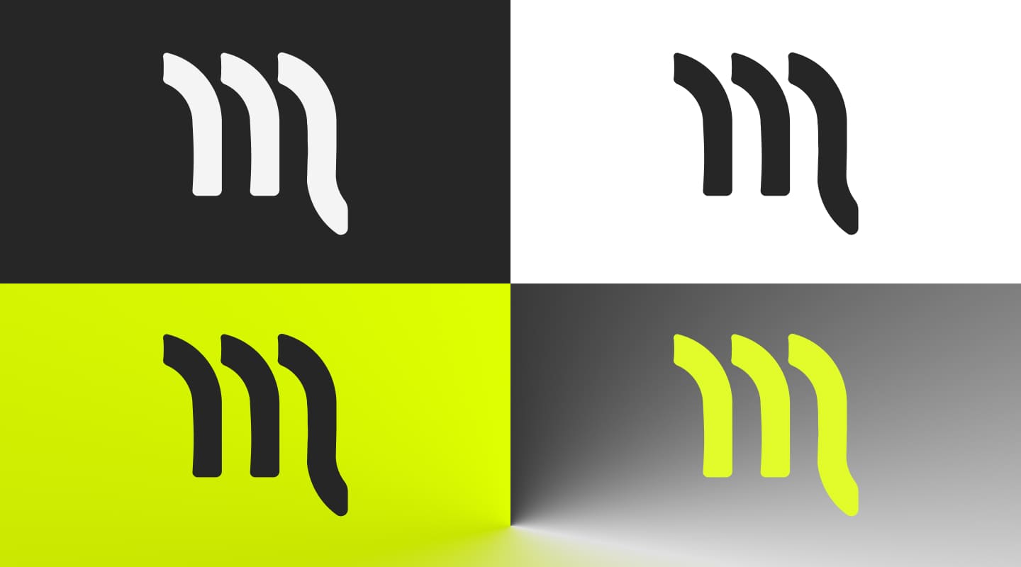
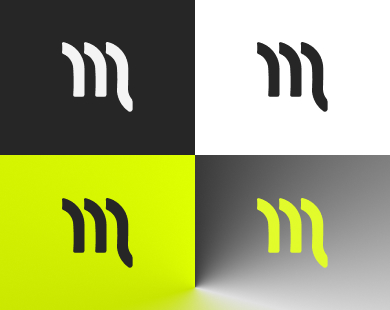
High logo contrast ensures that the design is easily recognizable and legible across different backgrounds, sizes, and viewing conditions. It enhances visibility and creates a strong visual impact, allowing the logo to stand out and convey the brand's message effectively. This is crucial for maintaining brand consistency and making a lasting impression on diverse audiences, whether in print, digital, or outdoor settings.

The blur test is a design technique used to evaluate a logo's clarity and recognizability by blurring it and observing how well its core shapes and elements remain identifiable. By applying a blur, distractions like fine details or intricate textures are minimized, helping designers assess whether the logo maintains its impact and communicates the brand effectively, even in less-than-ideal viewing conditions, such as from a distance or at small sizes. A successful logo passes the blur test by remaining distinct and recognizable despite the reduced detail.
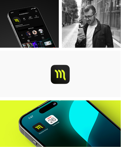
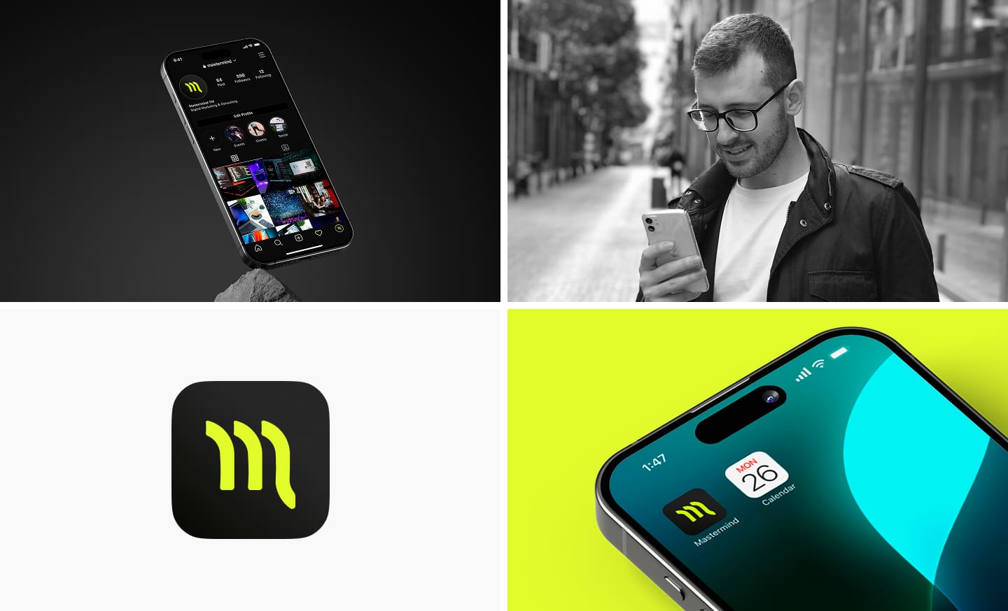
Design Concept: The logotypes were designed with a shared core aesthetic, incorporating consistent shapes, typography, and color palettes. Each department’s logo features unique variations—such as tailored icons, subtle color shifts, or distinct accents—to reflect the specific focus and character of that department while preserving the overall brand harmony.
Purpose and Impact: This set of logotypes creates a clear and professional visual system that communicates the individual roles of each department while emphasizing their connection to the parent company. It enhances brand recognition, facilitates internal and external communication, and establishes a modern, sophisticated image for the organization.



Send me your message and I will contact you back!